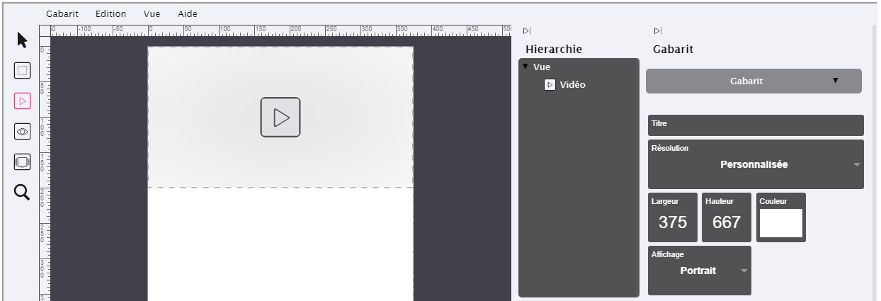
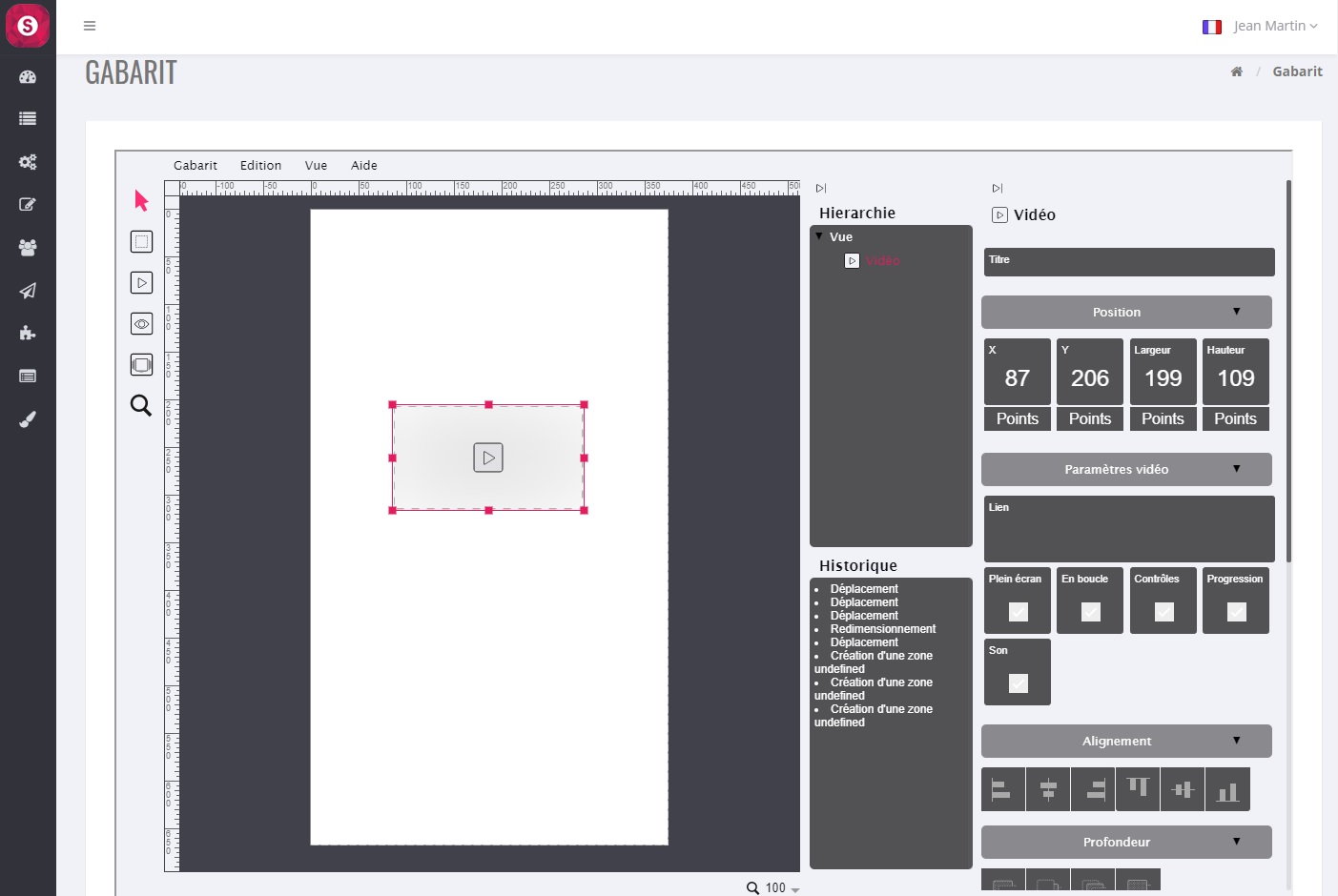
Area that allows you to install a video in your graphic view :
A click on the button “Video Zone”  makes appear at the top of the template a rectangle corresponding to this zone :
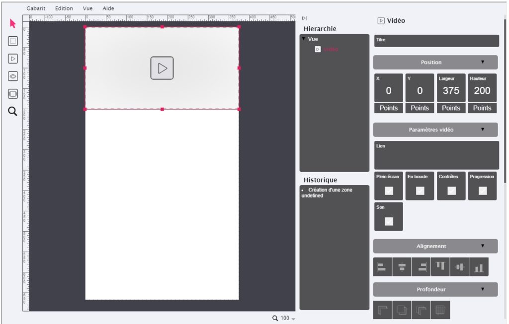
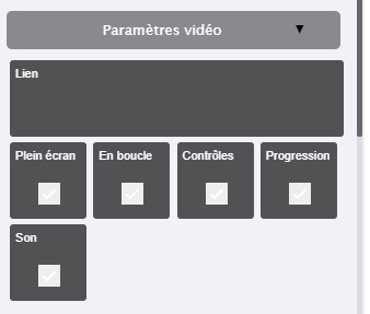
“Link” :allows you to download or enter the URL of the video that will be called at the time of the click. Two choices are possible :
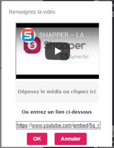
Link with a Youtube URL by entering it in the field “Or enter a link below”.
Link to a video you upload through “Submit media or click here”.
Warning: the videos are usually quite large.
This size is to be deducted from the total size allocated to your application, information visible in the “Dashboard” of your application. By default, the starting size is 500MB.
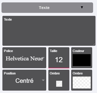
- “Full screen”: when the video is launched, it will be displayed in full screen.
- “En boucle” : permet de relancer automatiquement la vidéo lorsqu’elle est finit
- “Controls”: Adds a series of control buttons, such as play, pause, etc.
- “Progression”: brings up the progress bar of the video
- “Sound”: to activate or deactivate the sound of the video


- “Color” : to choose a background color. Warning: the background color will not be seen if for example you install a JPG type image, only the image will be seen. If on the other hand your image is PNG and has “transparent”, then the background will appear. Usually this parameter is used with text input (see 6 “Text”).
- “Image”: to choose the image to be installed in this area. You can drop the image at the indicated location. For info: if the width and height of your image do not match the width and height of this “generic zone”, then the image will always be whole (undistorted) and will automatically have the maximum size that could be inserted in this zone, without distorting your image.
- “Image format”: Allows, if necessary, to “force” the visual result.
- “Link”: Allows you to select the link that will be called at the time of the click. Several choices are possible:
- Link with an “Application content”, choose the element to launch
- Link to a “Web Page in the application”
- Link to “Web Browser”
- “Animation at the click”: small animation at the time of the click, the image shrinks and then returns to normal size.
- “Rotation”: Allows you to tilt this area. Enter a value directly (and press the “Enter” key) or click on it without releasing the click and then move up or down with the mouse.
- “Opacity”: adds to the image an opacity effect (like a watermark). Enter a value directly (and press the “Enter” key) or click on it without releasing the click then move up or down with the mouse.
- “Rounding”: only rounds the (background) color and not your image.
- “Border”: shows a border whose width in pixels is as shown.
- “Border” (color): Select a border color.