CONTENT PREVIEW ZONE

Content preview zone

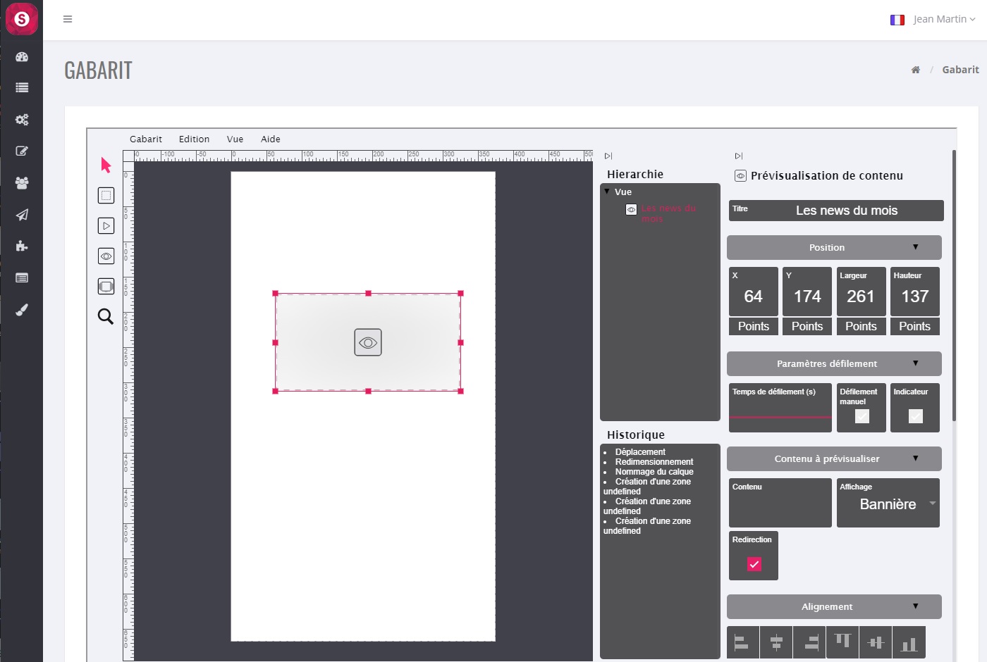
Convenient area that allows you to scroll through all the children in a container such as a heading for example.

A click on the “Content preview zone” button brings up a rectangle corresponding to this zone at the top of the template:

By clicking on this rectangle, it is selected (red rectangle with red dots) and it appears on the right-hand side all the parameters that can be modified for this zone:

Content preview area settings

We will detail all the parameters associated with this content preview area:

Optional but for better organization, it is advisable to define names for each field created.

2 "Position"

“X” and “Y” are the pixel coordinates of the top left corner of this area (here “0” and “0”).

“Width” and “Height” are the dimensions in pixels of this area (here “375” and “200”).

Several ways to modify them are possible:

Either directly on the red rectangle of the zone, a click on it without releasing it (anywhere) makes it possible to move the rectangle and thus to modify the coordinates “X” and “Y”; 

Or on one of the red points allowing to modify its dimensions;

Or double click on the value to be modified (right part) and directly enter the new value (be careful not to forget to press the “Enter” key);

Either a click without releasing in the square where there is the value to be modified (right part) and move the mouse up or down.

3 "Scroll parameters"

  •  “Scroll time(s)” : allows you to increase or decrease the display time, in seconds, of each element. Enter a value directly (and press the “Enter” key) or click on it without releasing the click, then move up or down with the mouse.
  • “Manual scrolling” : allows the user to manually slider.
  • “Indicator” : allows the user to visualize the number of elements that will scroll (small dots at the bottom of the zone). 

4 "Content to preview"

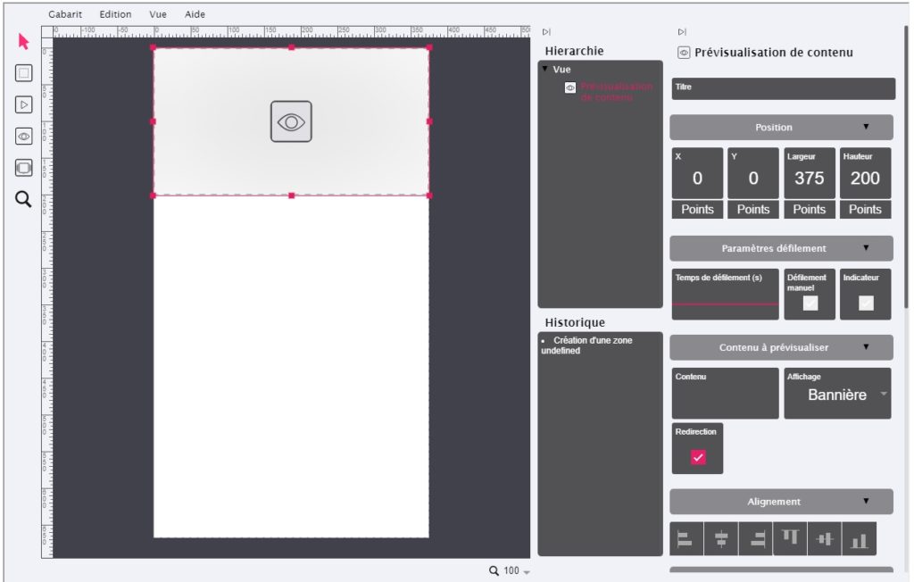
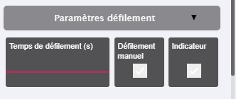
 “Content” : allows you to select the container element (or the parent) in order to scroll through its content (or its children) :  

Attention : think about the number of elements that will scroll (number of children). Indeed, if you have a large number of them then you will have to wait a certain time to see all these elements appear. When they have all scrolled, then the scrolling starts again from the first element.
 
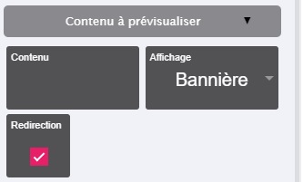
  • “Display”: selects the image field that will be used for these elements.
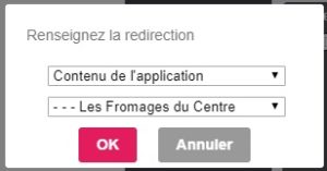
  • “Redirection”: Clicking on a scrolling element makes that element appear.

5 "Alignment"

These are convenient buttons that allow you to position the area in a specific location with a single click, such as :

  • Left edge (of the template)
  • Right edge (of the template)
  • High edge (of the template)
  • Low edge (of the template)
  • Horizontally centered (depending on template resolution)
  • Vertically centered (depending on template resolution)

6 "Depth"

If zones overlap, these buttons can be used to move one zone forward or backward relative to another :

  •  Send to background (or Ctrl + Shift + Down)
  •  Send Back (or Ctrl + Down)
  •  Send Forward (or Ctrl + Up)
  •  Bring to the foreground (or Ctrl + Shift + Up)

7 "Element"

Various parameters of this area are grouped together here :

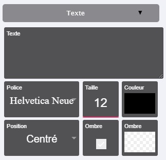
  •  “Color” : to choose a background color. Warning: the background color will not be seen if for example you install a JPG type image, only the image will be seen. However, if your image is a PNG image and has “transparent”, then the background will appear. Usually this parameter is used with a text input (see 6 “Text”).
 
  • “Image” : to choose the image to be installed in this area. You can drop the image at the indicated location. For informatio
  • n, if the width and height of your image do not correspond to the width and height of this “generic zone”, then the image will always be whole (undistorted) and will automatically have the maximum size that could be inserted in this zone, without distorting your image.


  • “Image format” : allows, if necessary, to “force” the visual result.
 
  • “Link” : Allows you to select the link that will be called at the time of the click. Several choices are possible :
    • Link with an “Application content”, choose the element to launch
    • Link to a “Web Page in the application”
    • Link to “Web Browser”
 
  • “Animation at the click” : small animation at the time of the click, the image shrinks and then returns to its normal size.
 
  • “Rotation” : Allows you to tilt this area. Enter a value directly (and press the “Enter” key) or click on it without releasing the click and then move up or down with the mouse.
 
  • “Opacity” : Adds an opacity effect (watermark type) to the image. Enter a value directly (and press the “Enter” key) or click on it without releasing the click, then move up or down with the mouse.
 
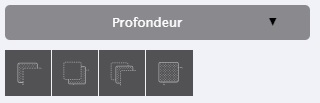
  • “Rounded” : Rounds only the (background) color and not your image. 
  • “Border” : shows a border whose width in pixels is as indicated.
 
  • “Border” (color) : To select a border color.
 

8 "Text"

It is possible to add text in this area.

  • Text : Text input field
  • Font : Font selection
  • Size : Selection of font size
  • Color : Selection of the color of the characters
  • Position : Allows you to position the whole text according to the size of the generic zone.
  • Shadow : Adds a shadow to the characters
  • Shadow : Shadow color selection
Tip : If you use a specific font, then we recommend that you enter the text in your favourite font in Photoshop for example. You will use this “image” (your text saved in Photoshop in image format) to be inserted in your generic area as an image.
Cette page en PDF :