GRAPHIC VIEW

Graphic view

shelpy-bulle vue graphique

The “Graphical view” element allows you to display a view grouping together elements without constraints. This element can only be used if the graphical view has been created in the “Graphical Views” menu.

In the navigation, its line will always be preceded by its logo :     

General tab

Global information of the Graphic View, list of fields :

  • Title
  • Subtitle
  • Type of content : “Graphic View”
  • Display : “Default” for a Graphic View
  • Parent : element that will be the parent of this Graphical View
  • Order : display order that depends on the parent. If “Parent” = “None” then this graphical view will appear in the top left menu
  • Enabled : Y/N
  • Visible : Y/N
  • Publication start date : handy to make this Graphic View appear at a specific date and time
  • End of publication date : handy to make this Graphic View disappear at a specific date and time. If there is no graphical view, it will be displayed all the time.

Content tab

List of fields :

  • Keywords : list of keywords allowing to quickly search this page when using the “Search Engine” element or if you activate the search in a field.
  • Graphic view : Select here the graphic view already created before.

Visual tab

Allows you to choose the visual appearance of the Graphical View BEFORE clicking on it, list of fields :

  • Title visible on Grid and Banner : If this Graphical View is part of a container, that is to say if for example this element “Graphical View” is a child of a field and if the display chosen in this field is either “Grid” or “Banner”, then there is the possibility to display or not the title of this element “Graphical View” in the image :
  • If Card View : If this Graphical View is part of a container, i.e. if for example this element “Graphical View” is a child of a field and if the display chosen in this field is “Card View”, then there is the possibility to display this element “Graphical View” in full width or half width. The combination of the 2 choices is possible:
  • Icon : Used for display in the top left menu, or if this item is one of the children of a container (e.g. heading) whose display is “Title”, “Subtitle”, “Distances” or “Glossary”.
  • Miniature : Used for a “Grid” display or replaces “Icon” if it does not exist.
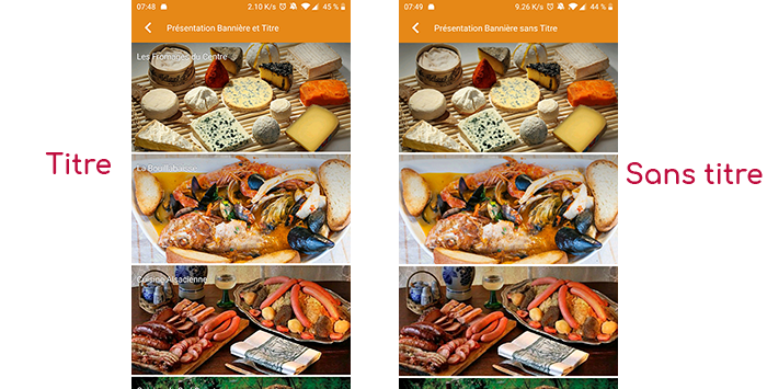
  • Banner : Used for display in “Banner” mode.

If there is an image in the three fields “Icon”, “Miniature” and “Banner”, then there is an order of priority for the choice of the image that will be displayed :

  1. Banner
  2. Miniature
  3. Icon
  4. If element “Page”: image of the content of this page
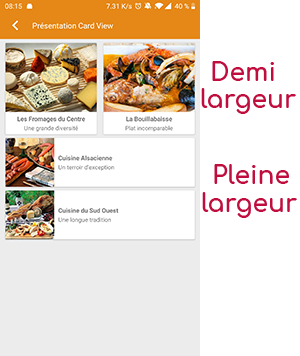
Caution : if the display of this item is “Title”, “Subtitle”, “Distances”, “Glossary”, “Grid” and “Card View” (full width), then the image shape must be square and if the display is “Banner” or “Card View” (half width), the image shape must be rectangular with a ratio of 1440×800 pixels.
Otherwise, your image may be truncated at the top and bottom, or right and left.

Coordinates tab

Tab not used for this “Graphic view” element.

Others tab

Various parameters such as the authorization of this element “Graphic view”, list of fields :

  • Habilitation : usable only if there is a management of mobinautes with groups of mobinautes. Example: Your mobinautes can be part of the groups “Citizens”, “Municipal agents” and “City council”. If this page element should only be visible for mobinautes that are at least part of the group “City Council”, then the authorization will be set to “Private” and the checkbox for the group “City Council” will be activated. If, on the other hand, access to this page element is left visible, but in order to display it you must be a member of the “Citizens” group, then the enablement will be set to “Protected” and the checkbox corresponding to the “Citizens” group will be activated.
  • Notification :
Cette page en PDF :