LOCATION

Location

shelpy-bulle localisation

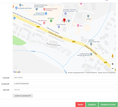
The “Location” element is very often used as a child of a “List/Map” or a “Google Map”. In the application, its display is characterized by :

  • An upper part represented by a “Google” type map with a point representing the GPS position entered in the “Coordinates” tab. By clicking on this map, it is possible to zoom in.
  • A lower part where the address is recalled (entered in the “Coordinates” tab) followed by the text entered in the “Content” tab.
  • A footer “ROUTE” which starts the route to this point from your current GPS position.
 In the navigation, its line will always be preceded by its logo :       
 

General tab

Global page information, list of fields :

  • Title
  • Subtitle
  • Type of content : “Location”
  • Display : “Default” for a location
  • Parent : element that will be the parent of this location
  • Order : display order that depends on the parent. If “Parent” = “None” then this location will appear in the top left menu.
  • Enabled : Y/N
  • Visible : Y/N
  • Publication start date : useful to show this location at a specific date and time.
  • End of publication date : practical to make this location disappear at a specific date and time. If there is none, it will be displayed all the time.

Content tab

List of fields :

  • Keywords : list of keywords allowing to quickly search for this location when using the “Search Engine” item or if you activate the search in a field.
  • Editeur de texte : The text editor (Wysiwyg) allows to format the text displayed by the Apps. The editor offers the following tools:
    • Paragraph display style (standard paragraph, title 1, title 2, etc.)
    • Font formatting: Bold, Italic, Highlighted, Strikethrough
    • Paragraph Alignment: Left, Right, Center, Justified
    • Enumerative list: with Number or Chip
    • Text color
    • Styles: From a predefined list
    • External link :
      • To URL web page: Enter the web address (url)
      • To e-mail: enter the recipient’s e-mail address, subject of the e-mail
      • To internal screen: choose from the list of existing content
    • Image : an image of type jpg or png can be inserted in the content
      • Click on the “Image” button in the text editor. A screen appears
      • On the ” Transfer ” tab, choose an image on the workstation and click on ” Send to server “.
      • On the ” Image Information ” tab, specify the image size and alignment

A link to an internal screen can be associated to an image to simulate for example a button (add an image then add an internal link).

Visual tab

Allows you to choose the visual appearance of the location BEFORE clicking on it, list of fields :

  • Visible title on Grid and Banner : If this localization is part of a container, i.e. for example if this element “localization” is a child of a heading and if the display chosen in this heading is either “Grid” or “Banner”, then there is the possibility to display or not to display the title of this element “localization” in the image :
  • If Card View : If this localization is part of a container, that is to say if for example this element “localization” is a child of a heading and if the display chosen in this heading is “Card View”, then there is the possibility to display this element “localization” in full width or half width. The combination of the 2 choices is possible:
  • Icon : Used for display in the top left menu, or if this item is one of the children of a container (heading for example) whose display is “Title”, “Subtitle”, “Distances” or “Glossary”.
  • Miniature : Used for a “Grid” display or replaces “Icon” if it does not exist.
  • Banner : Used for display in “Banner” mode.

If there is an image in the three fields “Icon”, “Thumbnail” and “Banner”, then there is an order of priority for the choice of the image that will be displayed :

  1. Banner
  2. Miniature
  3. Icon
  4. if element “Page”: image of the content of this page
Caution : if the display of this item is “Title”, “Subtitle”, “Distances”, “Glossary”, “Grid” and “Card View” (full width), then the image shape must be square and if the display is “Banner” or “Card View” (half width), the image shape must be rectangular with a ratio of 1440×800 pixels.
Otherwise, your image may be truncated at the top and bottom, or right and left.

Coordinates tab

Important tab for a location. Allows you to enter your GPS position via an address or via a precise latitude and longitude. It is also possible to enter a set of information:

  • Telephone : as soon as this field is filled in (telephone number), appears in the text: “Telephone: +33 484251600”.
  • E-mail address : as soon as this field is filled in (e-mail address), it appears in the text: “Mail: contact@synertic.fr”.
  • Link : field not retrieved in the text
  • Address 1 : First address line (The complete address appears in the text: “Address: …”)
  • Address 2 : Second address line
  • Postal code :
  • City :
  • Country :
  • Button “Locate address” : as soon as the address is correctly entered above, displays a Google map with a point positioning this address and fills in the two fields below: “Latitude” and “Longitude” of the values corresponding to this address.
  • Latitude :
  • Longitude :
  • Altitude :
  • Button “Locate GPS coordinates” : 
  • if there is no address entered but latitude and longitude coordinates, then this button allows you to view this position in the Google map.
  • If needed, to better position the GPS point, it is possible to move this point manually in the Google map by clicking on it and dropping the point at the desired location.

Others tab

Various parameters such as the authorization of this element “location”, list of fields :

  • Habilitation : usable only if there is a management of mobinautes with groups of mobinautes. Example: Your mobinautes can be part of the groups “Citizens”, “Municipal agents” and “City council”. If this location element should only be visible for mobinautes that are at least part of the “City Council” group, then the authorization will be set to “Private” and the checkbox for the “City Council” group will be activated. If, on the other hand, access to this location element is left visible, but in order to display it you have to be a member of the “Citizens” group, then the enablement will be set to “Protected” and the checkbox corresponding to the “Citizens” group will be activated.
  • Activate sharing : :
  • Notification :
Cette page en PDF :