FOLDER

Folder

shelpy-bulle rubrique

Most used container, the heading is materialized by a screen in the form of a list, proposing contents (of this heading).

In the navigation, its line will always be preceded by its logo :     

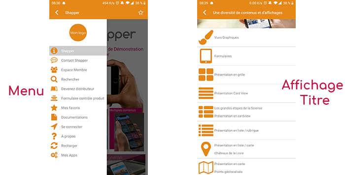
The headings represent branches in the navigation of the application. A field can view its child data in 7 different ways: Title, Subtitle, Banner, Grid, Distances, Card View, Glossary :

General tab

Global information of the heading, list of fields :

  • Title
  • Subtitle
  • Type of content : “Folder”
  • Display : List of the 7 display possibilities (see above)
  • Parent : Element that will be the parent of this item.
  • Order : display order that depends on the parent. If “Parent” = “None” then this item will appear in the top left menu.
  • Enabled : Y/N
  • Visible : Y/N
  • publication start date : convenient to show this heading at a specific date and time.
  • End of publication date : practical to make this heading disappear at a specific date and time. If there is none, it will be displayed all the time

Content Tab

List of fields :

  • Connector : when using a connector (allows to retrieve data outside the application), this is where it must be put in place. In this case, no element is created, the item in the BO will always remain empty and in the application it will be loaded with the data selected by the connector.
  • Search in the folder : as soon as the item is displayed in the application, there will be an active search field at the top for the children of this item.
  • Keywords : list of keywords that allow you to quickly search for this topic when using the “Search Engine” element or if you activate the search in a topic.

Visual tab

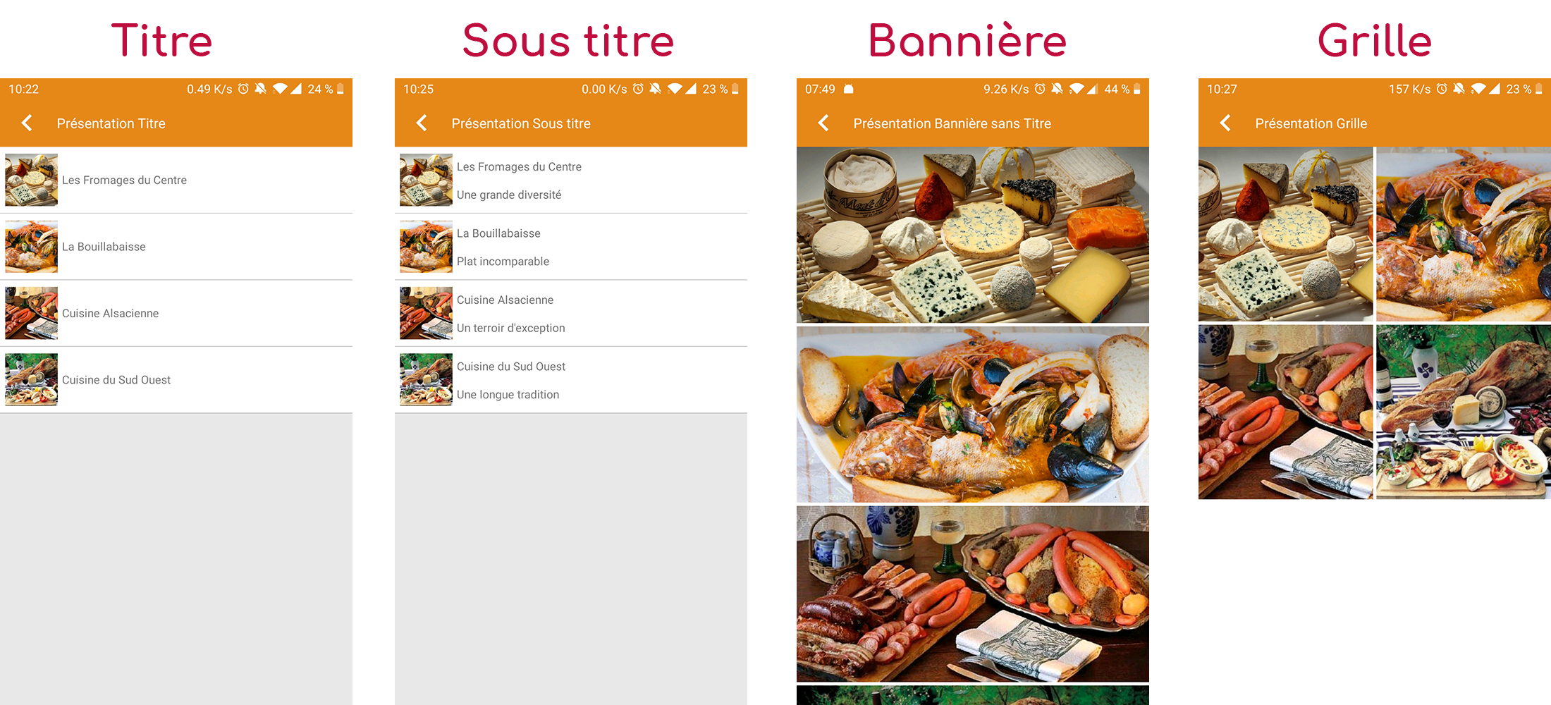
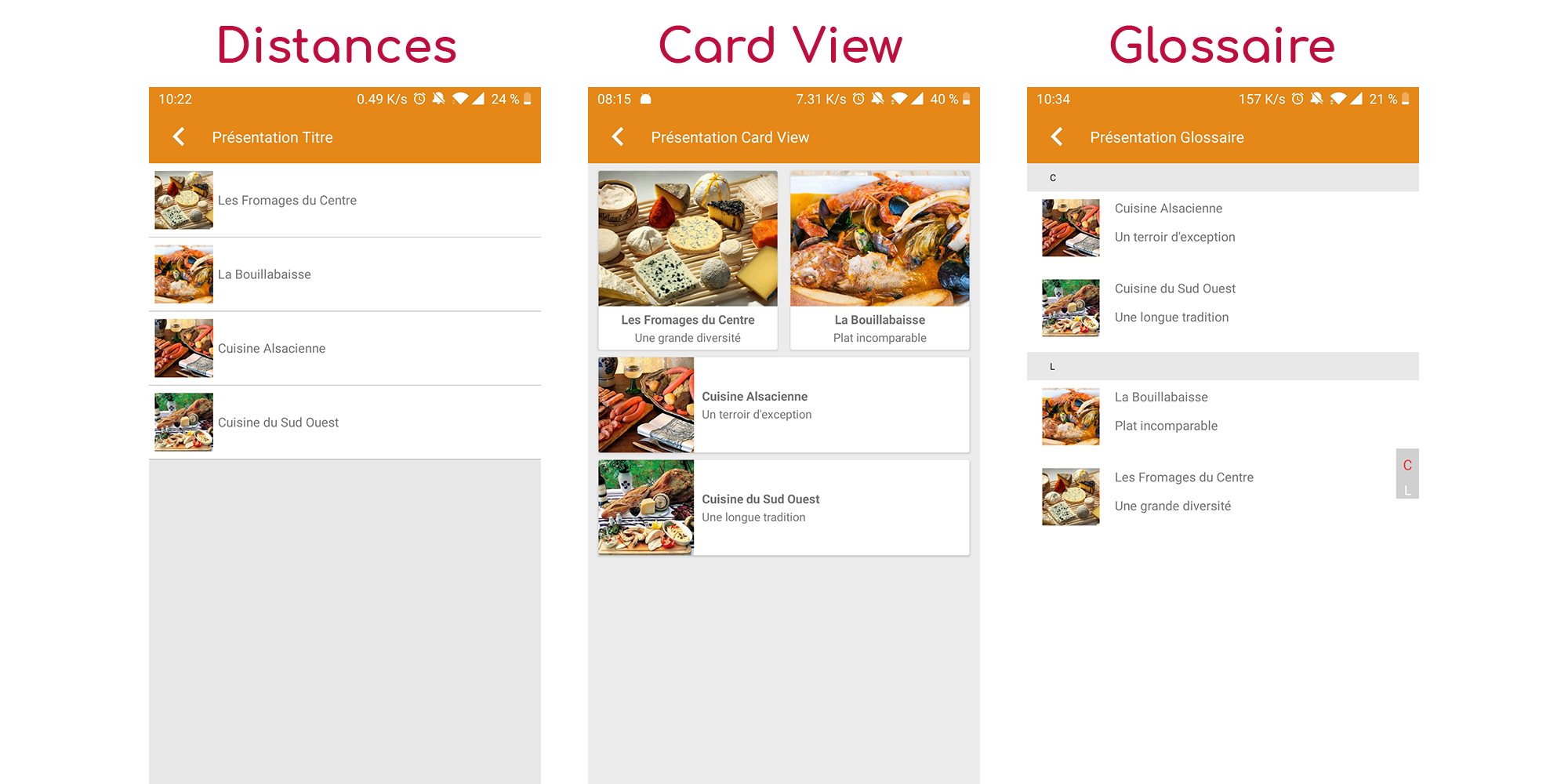
Allows you to choose the visual appearance of the field BEFORE clicking on it, list of fields :

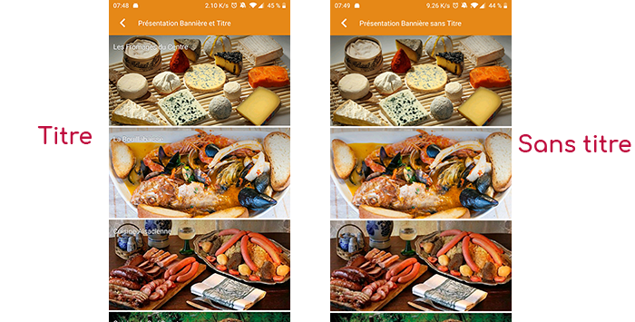
  • Title visible on Grid and Banner : If this field is part of another container, i.e. for example if this item “Field” is a child of another field and if the display chosen in this field is either “Grid” or “Banner”, then there is the possibility to display or not to display the title of this item “Field” in the image :
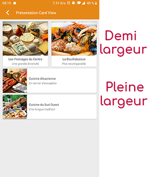
  • If Card View : If this field is part of another container, i.e. if for example this “Field” element is a child of another field and if the display chosen in this field is “Card View”, then there is the possibility to display this “Field” element in full width or half width. The combination of the 2 choices is possible:
  • Icon : Used for display in the top left menu, or if this item is one of the children of another container (e.g. heading) whose display is “Title”, “Subtitle”, “Distances” or “Glossary”.
  • Miniature : Used for a “Grid” display or replaces “Icon” if it does not exist.
  • Banner : Used for display in “Banner” mode.

If there is an image in the three fields “Icon”, “Thumbnail” and “Banner”, then there is an order of priority for the choice of the image that will be displayed :

  1. Banner
  2. Miniature
  3. Icon
  4. If element “Page”: image of the content of this page
Caution : if the display of this item is “Title”, “Subtitle”, “Distances”, “Glossary”, “Grid” and “Card View” (full width) then the shape of the image must be square, and if the display is “Banner” or “Card View” (half width) then the shape of the image must be rectangular with a ratio of 1440×800 pixels.
Otherwise, your image may be truncated at the top and bottom, or right and left.

Coordinates tab

Is not used for a folder.

Others tab

Various parameters such as the authorization of this item “Heading”, list of fields :

  •  Habilitation : usable only if there is a management of mobinautes with groups of mobinautes. Example: Your mobinautes can be part of the groups “Citizens”, “Municipal agents” and “City council”. If this heading element should only be visible for mobinautes that are at least part of the “City Council” group, then the authorization will be set to “Private” and the checkbox corresponding to the “City Council” group will be activated. If, on the other hand, access to this item is left visible but you have to be a member of the “Citizens” group to display it, then the enablement will be set to “Protected” and the checkbox corresponding to the “Citizens” group will be activated.
  • Activate sharing :
  • Notification :
Cette page en PDF :