Based on the principle of a “Folder” but allowing to display geo-localized data in the form of a list and in the form of a map (List / Map buttons). These geolocalised data must be positioned as children of the List / Map heading.
In the navigation, its line will always be preceded by its logo : 
- Allows you to choose the visual appearance of the List / Map BEFORE clicking on it, list of fields :
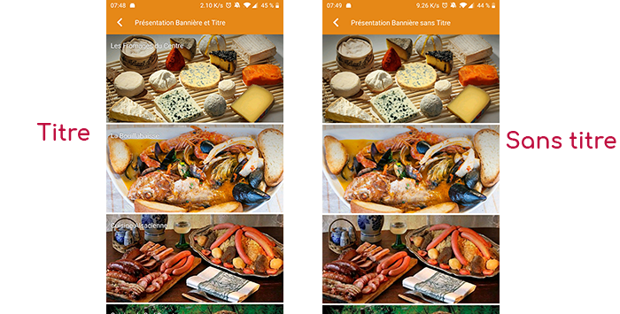
- Title visible on Grid and Banner : If this List/Card is part of another container, that is to say if for example this item “List/Card” is a child of another heading and if the display chosen in this heading is either “Grid” or “Banner”, then there is the possibility to display or not the title of this item “List/Card” in the image :
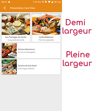
- If Card View : If this List/Card is part of another container, i.e. for example if this item “List/Card” is a child of another heading and if the display chosen in this heading is “Card View”, then there is the possibility to display this item “List/Card” in full width or half width. The combination of the 2 choices is possible :
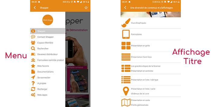
- Icon : Used for display in the top left menu, or if this item is one of the children of another container (e.g. heading) whose display is “Title”, “Subtitle”, “Distances” or “Glossary”.
- Miniature : Used for a “Grid” display or replaces “Icon” if it does not exist.
- Bannière : Used for display in “Banner” mode.
If there is an image in the three fields “Icon”, “Thumbnail” and “Banner” then there is an order of priority for the choice of the image that will be displayed :
- Banner
- Miniature
- Icon
- If element “Page”: image of the content of this page
Caution : if the display of this item is “Title”, “Subtitle”, “Distances”, “Glossary”, “Grid” and “Card View” (full width) then the image shape must be square, and if the display is “Banner” or “Card View” (half width) then the image shape must be rectangular with a ratio of 1440×800 pixels.
Otherwise, your image may be truncated at the top and bottom, or right and left.